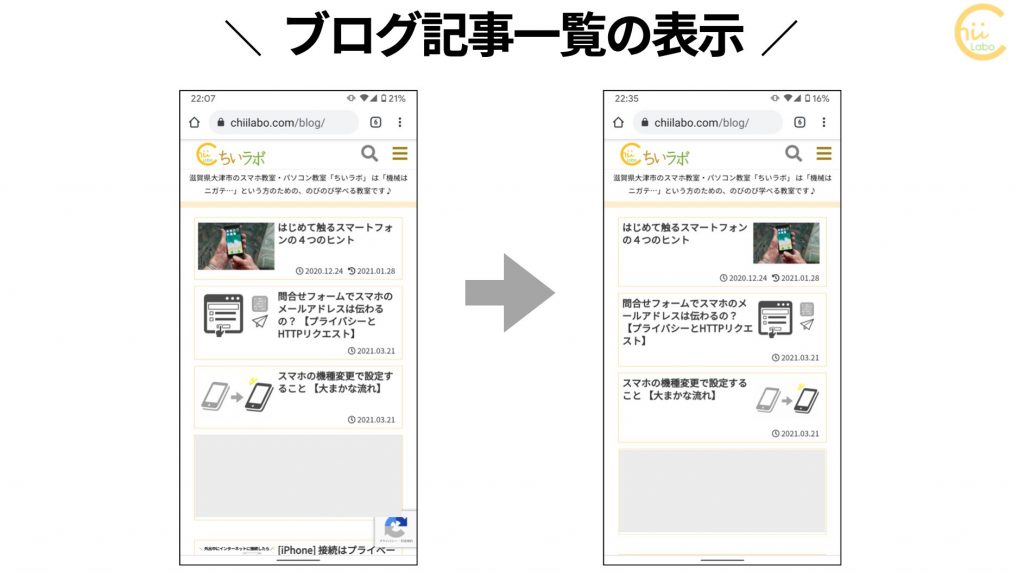
久々にホームページのCSSをいじりました。今回は、記事一覧の画像と文字の配置です。
これも、note風スタイルの一環ですね。
アイキャッチ画像より、タイトル文に目がいくようにする意図で、変更しました。
常に左から読んで行けるほうが、目にラクな気がします。
といって、そこまでブログ一覧はアクセスがないんですが……笑
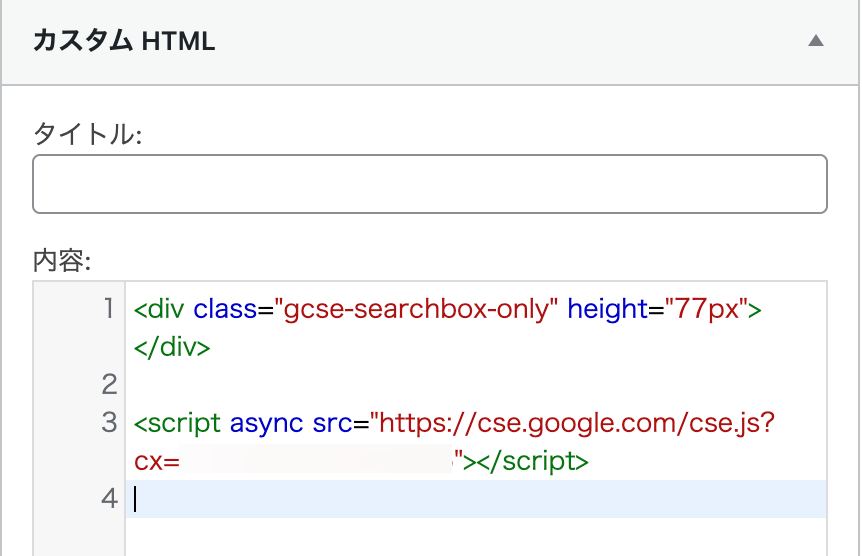
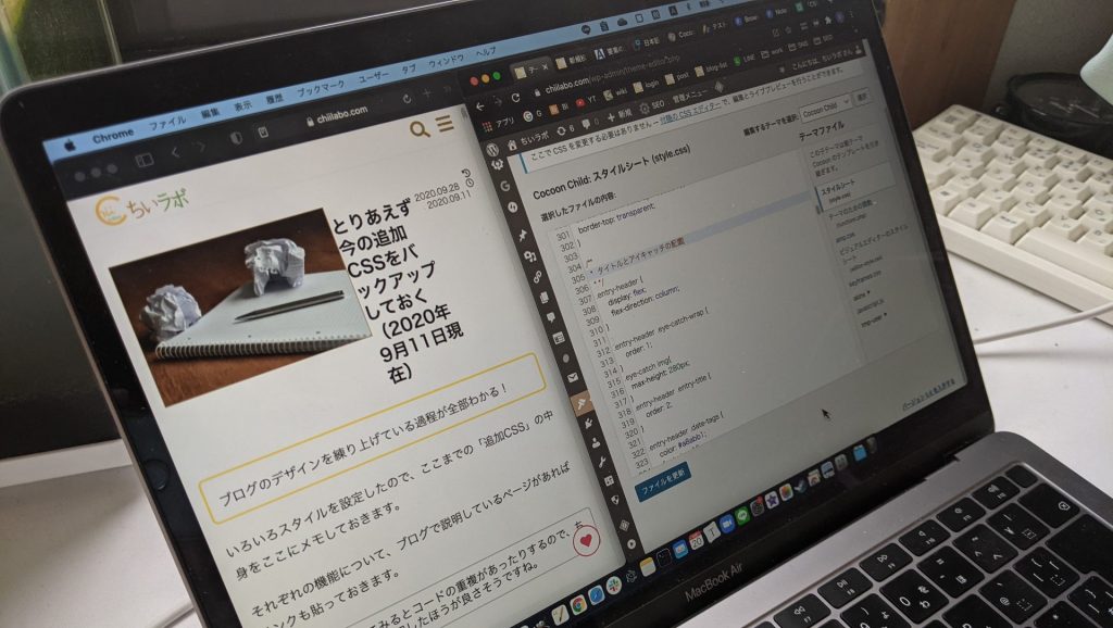
1. CSS
CSSはこんな感じです。
display: flexで下位の要素の順番(order)を変更できるようにしています。
/** 記事一覧 */
article.entry-card {
	display: flex;
	flex-direction: row;
}
.entry-card-thumb {
	order:2;
	padding-bottom: 1.2em;
}
.entry-card-content {
	order:1;
	margin-left: 0;
	margin-right: 0%;
	width:75%;
}
合わせて、サイドバーの記事一覧も変更しました。
/** ウィジェット記事一覧 */
.widget-entry-card {
	display: flex;
	flex-direction: row;
}
.widget-entry-card figure {
	order:2;
}
.widget-entry-card-content {
	margin-left:0;
	order:1;
	width: 75%;
}
ついでに、関連記事の一覧も変えました。
/** 関連記事一覧 */
article.related-entry-card {
	display: flex;
	flex-direction: row;
}

.related-entry-card figure{
	order:2;
	padding-bottom: 0.9em;
	margin-right:0;
	width: 100%;
}

.related-entry-card-content {
	order:1;
	margin-left:0;
	margin-right:0;
	width: 80%;
}
.rect-mini-card .related-entry-card-content {
	margin-left:0;
	margin-right:0;
	width: 80%;
}
編集では、左右のバランスを調整するために、余白(margin)や幅(width)の処理で、いろいろ試行錯誤しました。
こちらもどうぞ。
![[Cocoon]外部ブログカードのサイトアイコンを上に移動した【CSSのposition:absolute】](https://chiilabo.com/wp-content/uploads/2024/05/image-13-2-1024x576.jpg)
[Cocoon]外部ブログカードのサイトアイコンを上に移動した【CSSのposition:absolute】
以前、funtions.phpでテンプレートを変更することで、ブログカードのデザインを変更しました。しかし、「デザインを変更するならCSS」ということで、改めて挑戦してみました。こんなふうに変えましたいつものようにビフォー・アフターをお見せします。↓こうなりました。HTML要素を変更せずにちゃんとCSSでデザインを変えられました。CSSコードはこちらポイントはblogcard-footer要素の位置をabsolute(絶対配置)にして、移動することです。親要素内に自由に配置で...
chiilabo.com

[Cocoon] ブログ記事の作成日時・更新日時を2段にする 【white-space pre】
ブログ記事のタイトル部分のスタイルを少しいじりました。作成日時と更新日時を2段になるようにしました。こちらがCSSです。.entry-header .date-tags { order: 3; color: #a8abb1; font-si...
chiilabo.com
note風スタイル第3弾! Cocoonのアイキャッチをタイトルの上に変更した 【display-flex】
Cocoonのアイキャッチ画像は、既定ではタイトルの下に表示されます。今回はアイキャッチ画像をタイトルの上に表示されるように、スタイルシートを編集しました。これもnoteのデザインを参考にしています。タイトルと本文の位置が近くなるので、読みやすいですよね。Cocoon設定やPHP編集もいいけれど……アイキャッチ位置を変更する方法をざっと調べると…Cocoonの設定でアイキャッチを非表示にして本文中に画像挿入する方法content.phpを書き換えて表示位置を変更する方法が紹介...
chiilabo.com
[cc_img name=”note風ブログのフリーイラスト” url=”https://chiilabo.com/wp-content/uploads/2021/03/c121f27e5fc5f4b38617c67697fcd1e4-2-514×1024.png”]
QRコードを読み込むと、関連記事を確認できます。