
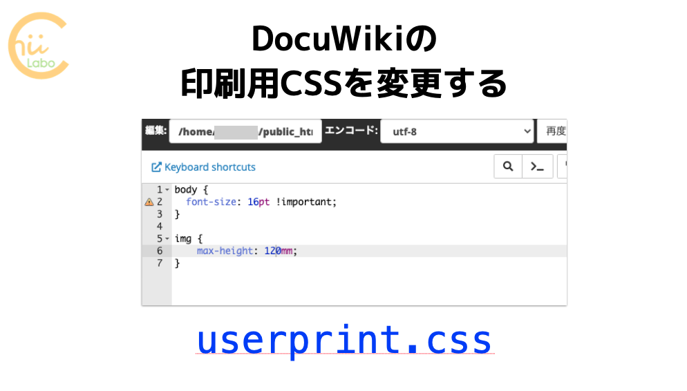
スタイルシートは表示画面だけではなく、印刷時のスタイルを指定することもできます。今回は、先日(2020年6月1日)更新した。追加スタイルシートの中身をまとめておきます。
追加CSSの中身
このブログは冊子印刷でA4に2ページ分印刷したときに、文字サイズなど読みやすいように編集しています。
そのまま印刷すると文字が大きすぎるかもしれません。
このホームページではちょこちょこっとしたスタイルはWordPressの追加CSSに記述しています。今回、少し整理したので、まずはずらっとCSSをお見せして、一部ずつ説明してみます。
/**
* 印刷時のフォント
*/
@media print  {
	p {
		font-family: 'Noto Serif JP', serif;
		text-indent: 1.0em;
		line-height: 2.0em;

	}
	.block-box p, .wp-block-quote p {
		font-family: 'Kosugi', sans-serif;
		text-indent: 0em;
		line-height: 1.7em;
	}
	.wp-block-quote {
		margin: 1em;
	}
}


/**
* モバイルメニューボタン
*/
.mobile-menu-buttons {
	color: #a08010;
}
.mobile-menu-buttons .home-menu-button > a {
	color: #a08010;
}
.mobile-menu-buttons .top-menu-button > a {
	color: #a08010;
}

.mobile-menu-buttons .menu-button > a {
	color: #a08010;
}

@media screen and (max-width: 599px)
{
	.container .column-wrap {
		flex-direction: row;
	}
}

/**
* 広告ブロック
*/
.wp-block-vk-blocks-pr-blocks {
	display: inline-flex;
	flex-direction: row;
	align-content: center;
	width: 100%;
	justify-content: center;
}
.vk_prBlocks_item_link {

	text-decoration-line: none;

}
.vk_prBlocks_item_title, .article h3 {
	border-left: 1px solid #f0c020;
}
.vk_prBlocks_item, .col-sm4 {
	width: 1045px;
}
.vk_prBlocks_item_summary {
	font-size: 14px;
}

@media screen and (max-width: 599px)
{
	.vk_prBlocks_item_title, .article h3 {
		font-size: 16px;
	}
	.wp-block-vk-blocks-pr-blocks {

	}
}


/**
 * 吹き出しの設定
 */
.speech-balloon {
	font-size: 110%;
	line-height: 1.5em;
}

/**
 * 強調文字列・マーカー
 */
 .bold {
 	font-family: 'Kosugi', sans-serif;
 	font-size: 120%;

 }
.marker-under, .marker-under-red, .marker-under-blue {
	-webkit-print-color-adjust: exact;
}
.marker-under-red {
	font-family: 'Kosugi', sans-serif;
	font-weight: 600;
	font-size: 125%;

}
.marker-under {
	font-family: 'Kosugi', sans-serif;
	font-weight: 600;
	font-size: 120%;

}
.marker-under-blue {
	font-family: 'Kosugi', sans-serif;
	font-weight: 600;
	font-size: 120%;

}

/**
 * 画像
 */
.wp-block-image img, .eye-catch img {
	border: 3px solid #f0c020;
}

/**
 * リストを目立たせる
 */
.article ul li, .article ol li {
	font-size: 110%;
	font-weight: 600;
}
.article ul, .article ol {
	margin: 1.3em;
	page-break-inside: avoid;
}

/**
* ページ余白
*/
@page {
	size: A4;
	margin-top: 10mm;
	margin-bottom: 10mm;
	margin-left: 15mm;
	margin-right: 15mm;
}

/**
* 印刷時用紙サイズ
*/
@media print {
	#container .main, #container .content, #container .wrap {
		top:0 !IMPORTANT;
		left:0 !IMPORTANT;
		width:180mm !IMPORTANT;
		font-size: 15pt;
	}
	body {
		width: 180mm; /* needed for Chrome */
	}
	.wrap {
		width: auto;
	}
}
	/**
	* アイキャッチ画像のサイズ
	*/
@media print {
	.eye-catch img {
		max-width: 100%;
		height:100%;
		width: 100%;
		max-height: 420px;
		object-fit: contain;
	}
	.eye-catch-wrap {
		display:block;
		text-align:center;
		max-width: 100%;
		width: 100%;
		max-height: 420px;

	}
	/**
	* 記事内画像のサイズ
	*/
	.wp-block-image, .size-large {
		page-break-before:avoid  !IMPORTANT;
		/*display:inline   !IMPORTANT*/;
		text-align:center;

	}
	.wp-block-image, .size-large img {
		max-height: 450px;
		max-width: 100%;
		width: 100%;
		object-fit: contain;
	}
}

/**
* 記事内のブロックの余白
*/
@media print {
	.entry-content>*, .demo .entry-content p {
		line-height: 1.5;
		margin-top: 0.5em;
		margin-bottom: 0.5em;
	}
	.wp-block-cocoon-blocks-balloon-ex-box-1, .wp-block-cocoon-blocks-icon-box, .wp-block-cocoon-blocks-tab-box-1 {
		page-break-inside: avoid;
		margin-top: 1.0em;
		margin-bottom: 1.0em;
	}
}

/**
* 見出しの余白
*/
@media print {
	#container h1, #container h2, #container h3, #container h4, #container h5, #container h6 {
		background-color: transparent;
		border-width: 0;
		padding: 0;
		margin-top: 1.7em;
		margin-bottom: 0.2em;
		color: #333;

		page-break-after:avoid;
	}
	#container h1 {
		font-size: 14pt;
		margin-top: 0em;
	}
	#container h2 {
		font-size: 140%;
		margin-top: 2.5em;
		margin-bottom: 2.0em;
		display:inline-block  !IMPORTANT;
		page-break-after:avoid  !IMPORTANT;

		/* page-break-before:avoid;	 */
	}
}

/**
* 印刷時のブログカードの設定
*/
@media print {
	.blogcard-footer 	{
		display: none;
	}
	.blogcard-title {
		line-height: 1.3em;
	}
	.blogcard-snippet {
		display: none;
		/* 		font-family: 'Noto Serif JP', serif;
		line-height: 1.3em; */
	}
}
/**
* 印刷時の吹き出し
*/
@media print {
	.speech-balloon {
		font-family: 'M PLUS 1p', sans-serif  !IMPORTANT;
		font-weight: 200  !IMPORTANT;
	}
	.speech-balloon p {
		line-height: 1.4em;
		margin-bottom: 0.3em !IMPORTANT;
	}
}
/**
* 非表示の項目
*/
@media print {
	.read-time, .video-container, .button-block {
		display: none;
	}
}
長い…
それでは、ちょっとずつ説明します。
印刷時のフォント @media print
/**
* 印刷時のフォント
*/
@media print  {
	p {
		font-family: 'Noto Serif JP', serif;
		text-indent: 1.0em;
		line-height: 2.0em;

	}
	.block-box p, .wp-block-quote p {
		font-family: 'Kosugi', sans-serif;
		text-indent: 0em;
		line-height: 1.7em;
	}
	.wp-block-quote {
		margin: 1em;
	}
}
ここでは、印刷時のフォント(font-family)や字下げ(text-indent)・行間(line-height)を決めています。特にフォントは、印刷時の地の文が「Noto明朝体」になるように変更しています。先に全体のフォントは指定しないと、後で設定している強調文字列の「小杉ゴシック」がキャンセルされるのです。
「@media print」がポイントで、印刷時のみに適用されるスタイルを表します。逆に「@media screen and (max-width: 599px)」だと、600ピクセル未満のスクリーン表示、つまりスマートフォン表示時のみに適用されるスタイルになります。これをメディアクエリといいます。
モバイルメニューボタン
/**
* モバイルメニューボタン
*/
.mobile-menu-buttons {
	color: #a08010;
}
.mobile-menu-buttons .home-menu-button > a {
	color: #a08010;
}
.mobile-menu-buttons .top-menu-button > a {
	color: #a08010;
}

.mobile-menu-buttons .menu-button > a {
	color: #a08010;
}

@media screen and (max-width: 599px)
{
	.container .column-wrap {
		flex-direction: row;
	}
}
ここでは、モバイルメニューボタンの色を指定しています。モバイルメニューそのものは、「外観」の「メニュー」で「ヘッダーモバイルボタン」と「フッターモバイルボタン」を追加しました。

広告ブロック
/**
* 広告ブロック
*/
.wp-block-vk-blocks-pr-blocks {
	display: inline-flex;
	flex-direction: row;
	align-content: center;
	width: 100%;
	justify-content: center;
}
.vk_prBlocks_item_link {

	text-decoration-line: none;

}
.vk_prBlocks_item_title, .article h3 {
	border-left: 1px solid #f0c020;
}
.vk_prBlocks_item, .col-sm4 {
	width: 1045px;
}
.vk_prBlocks_item_summary {
	font-size: 14px;
}

@media screen and (max-width: 599px)
{
	.vk_prBlocks_item_title, .article h3 {
		font-size: 16px;
	}
	.wp-block-vk-blocks-pr-blocks {

	}
}
これは広告ブロック関係のスタイルのようです。自分で編集した記憶がないです。
吹き出しとマーカーのフォント
/**
 * 吹き出しの設定
 */
.speech-balloon {
	font-size: 110%;
	line-height: 1.5em;
}

/**
 * 強調文字列・マーカー
 */
 .bold {
 	font-family: 'Kosugi', sans-serif;
 	font-size: 120%;

 }
.marker-under, .marker-under-red, .marker-under-blue {
	-webkit-print-color-adjust: exact;
}
.marker-under-red {
	font-family: 'Kosugi', sans-serif;
	font-weight: 600;
	font-size: 125%;

}
.marker-under {
	font-family: 'Kosugi', sans-serif;
	font-weight: 600;
	font-size: 120%;

}
.marker-under-blue {
	font-family: 'Kosugi', sans-serif;
	font-weight: 600;
	font-size: 120%;

}
マーカーのところでは、ウェブフォントの変更をしました。フォントはスタイルシートだけでなく、HTMLの方でも読み込む必要があります。これは印刷時・スクリーン表示時の共通の処理にしています。
画像とリストを目立たせる
/**
 * 画像
 */
.wp-block-image img, .eye-catch img {
	border: 3px solid #f0c020;
}

/**
 * リストを目立たせる
 */
.article ul li, .article ol li {
	font-size: 110%;
	font-weight: 600;
}
.article ul, .article ol {
	margin: 1.3em;
	page-break-inside: avoid;
}
これも印刷時・スクリーン表示時の共通の処理です。記事内の画像に枠をつけたり、リストを太字にしています。
「.wp-block-image img」という表記の仕方は、
<div class=”wp-block-image”>の中の
<img>タグのスタイル、
という意味です。
classを指定できるのはdiv以外にもありますが、divが一番多いと思います。指定するクラス名の前にドットをつけ、タグの前にはつけないのがポイントですね(ちなみにIDだと#をつける)。
「page-break-inside: avoid;」は、要素の途中でページを分割しない、ということで、印刷のためのスタイルです。
A4に合わせたページ余白
/**
* ページ余白
*/
@page {
	size: A4;
	margin-top: 10mm;
	margin-bottom: 10mm;
	margin-left: 15mm;
	margin-right: 15mm;
}
余白はブラウザでの印刷時に変更できますが、スタイルシート側からも指定できます。
ページのサイズ
/**
* 印刷時用紙サイズ
*/
@media print {
	#container .main, #container .content, #container .wrap {
		top:0 !IMPORTANT;
		left:0 !IMPORTANT;
		width:180mm !IMPORTANT;
		font-size: 15pt;
	}
	body {
		width: 180mm; /* needed for Chrome */
	}
	.wrap {
		width: auto;
	}
}
全体の幅を設定すると、文字の折返しや画像の最大サイズを調整できます。
ハマりポイントでした…。これが正しく指定できていないと、大きな画像が印刷時にはみ出たり、自動で縮小されることで、バランスが崩れます。
画像のサイズ object-fit: contain;
	/**
	* アイキャッチ画像のサイズ
	*/
@media print {
	.eye-catch img {
		max-width: 100%;
		height:100%;
		width: 100%;
		max-height: 420px;
		object-fit: contain;
	}
	.eye-catch-wrap {
		display:block;
		text-align:center;
		max-width: 100%;
		width: 100%;
		max-height: 420px;

	}
	/**
	* 記事内画像のサイズ
	*/
	.wp-block-image, .size-large {
		page-break-before:avoid  !IMPORTANT;
		/*display:inline   !IMPORTANT*/;
		text-align:center;

	}
	.wp-block-image, .size-large img {
		max-height: 450px;
		max-width: 100%;
		width: 100%;
		object-fit: contain;
	}
}
アイキャッチ(記事のサムネイル画像)と通常の記事内の画像のサイズを調整しています。
- 横長の画像はなるべく大きく
- 縦長の画像はあんまり大きくなりすぎず
- 縦横比はそのままで
ということをしたくて、だいぶいろいろ調整しました。
結局、max-width, max-height, width, heightの使い方がよくわかってなくて、「横長画像が小さくなるか、縦長画像の縦横比がおかしくなるか」でハマりました。「object-fit: contain;」というスタイルを見つけて、解決しました。これは、縦横比が変わらないように画像の枠「内」に余白をつくる、というスタイルです。
パラグラフの行間など
/**
* 記事内のブロックの余白
*/
@media print {
	.entry-content>*, .demo .entry-content p {
		line-height: 1.5;
		margin-top: 0.5em;
		margin-bottom: 0.5em;
	}
	.wp-block-cocoon-blocks-balloon-ex-box-1, .wp-block-cocoon-blocks-icon-box, .wp-block-cocoon-blocks-tab-box-1 {
		page-break-inside: avoid;
		margin-top: 1.0em;
		margin-bottom: 1.0em;
	}
}
これは通常の記事内のパラグラフと、吹き出し・アイコンボックス・タブボックスの行間の設定です。
これが吹き出しで
これがタブボックスです。
吹き出し・アイコンボックス・タブボックスは、テーマCocoonのブロック要素です。
見出しと改ページ
/**
* 見出しの余白
*/
@media print {
	#container h1, #container h2, #container h3, #container h4, #container h5, #container h6 {
		background-color: transparent;
		border-width: 0;
		padding: 0;
		margin-top: 1.7em;
		margin-bottom: 0.2em;
		color: #333;

		page-break-after:avoid;
	}
	#container h1 {
		font-size: 14pt;
		margin-top: 0em;
	}
	#container h2 {
		font-size: 140%;
		margin-top: 2.5em;
		margin-bottom: 2.0em;
		display:inline-block  !IMPORTANT;
		page-break-after:avoid  !IMPORTANT;

		/* page-break-before:avoid;	 */
	}
}
見出しだけがページの最後になるのが嫌だったので、改ページの設定をがんばったんですが、結局うまくいきませんでした。ざっと調べたところ、どうもGoogle Chromeでは「page-break-after:avoid;」が動作しないようです。
この検証に半日かかりました💦
何か良い方法が見つかったら追記します。
印刷時のブログカード display: none
/**
* 印刷時のブログカードの設定
*/
@media print {
	.blogcard-footer 	{
		display: none;
	}
	.blogcard-title {
		line-height: 1.3em;
	}
	.blogcard-snippet {
		display: none;
		/* 		font-family: 'Noto Serif JP', serif;
		line-height: 1.3em; */
	}
}
印刷物のブログカードは少しシンプルになるように、更新日やスニペット(冒頭文)を非表示にしました。
印刷時の吹き出し .speech-balloon
/**
* 印刷時の吹き出し
*/
@media print {
	.speech-balloon {
		font-family: 'M PLUS 1p', sans-serif  !IMPORTANT;
		font-weight: 200  !IMPORTANT;
	}
	.speech-balloon p {
		line-height: 1.4em;
		margin-bottom: 0.3em !IMPORTANT;
	}
} /*end of print*/
吹き出しは本文とのバランスで太くするか細くするか、迷っているのがこのスタイルにあらわれています。印刷時の本文を明朝体にしたので、今回はやや細字になるようにしています。
非表示の項目 display: none
/**
* 非表示の項目
*/
@media print {
	.read-time, .video-container, .button-block {
		display: none;
	}
}
スクリーンでは表示するけれど印刷時には非表示にするブロック項目を指定しています。
今回の収穫は「@media print」という指定方法です。ブログそのものはいじらずに、印刷時にスッキリさせることができます。
約一日がかりでスタイルを設定しました。お疲れさまでした。
こちらもどうぞ
